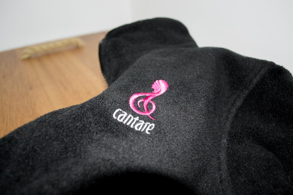
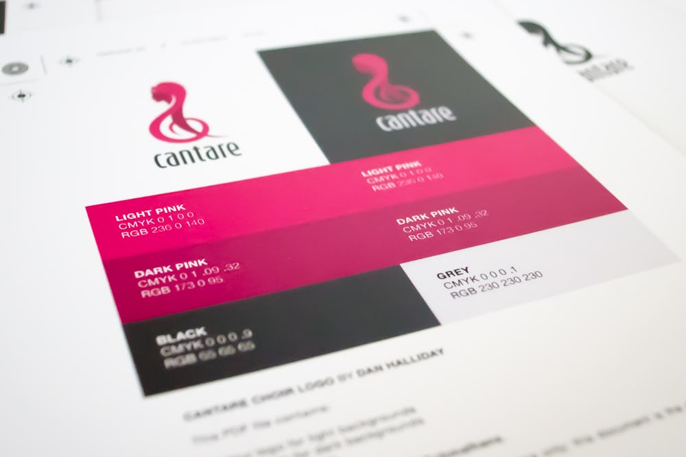
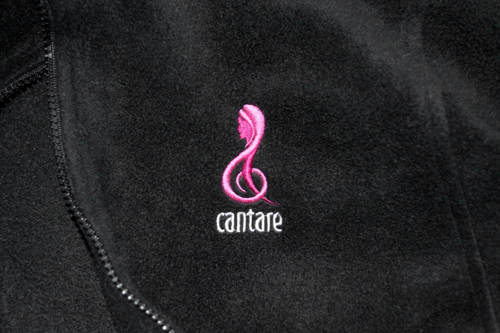
Cantare needed a strong, bold logo to use on everything from posters and concert programmes to bags and embroidered coats. They already had a strong black and pink colour scheme, so I worked with the group on a combination mark that would tie their brand together.

After several prototypes and lots of feedback, we settled on a treble clef mark shaped to depict a young woman. FF Schmalhans was a natural fit for the lettering — the tall, angled characters are intended to mimic the proud, singing women.


